
| 24-hour forecasts |
48-hour forecasts |
|||
| POP |
POPhi |
POP |
POPhi |
|
| Brier score |
0.144 |
0.037 |
0.178 |
0.044 |
| Reliability |
0.025 |
0.003 |
0.027 |
0.003 |
| Resolution |
0.060 |
0.020 |
0.036 |
0.011 |
| Uncertainty |
0.179 |
0.054 |
0.187 |
0.052 |
| Brier skill score |
0.194 |
0.312 |
0.047 |
0.146 |
 The
reliability of the forecasts, that is, the degree to which the forecast
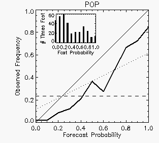
probabilities match the observed frequencies, can be assessed using a reliability diagram.
The
reliability of the 24-hour POP forecasts is shown by the heavy line in
the diagram at left. If the forecasts had perfect reliability (i.e., no
bias) this
curve would lie along the diagonal 1:1 line. The dashed horizontal line
shows the climatological frequency, and the dotted line midway between
the 1:1 line and the horizontal denotes no skill relative to
climatology. The location of the
reliability curve to the right of the diagonal indicates that the
probabilities were overestimated for all but the zero-probability
cases, and only for the higher probability categories did the POP
forecasts have more skill than climatology. The bar chart in the upper
left of the plot shows the number of
times each probability value was predicted.
The
reliability of the forecasts, that is, the degree to which the forecast
probabilities match the observed frequencies, can be assessed using a reliability diagram.
The
reliability of the 24-hour POP forecasts is shown by the heavy line in
the diagram at left. If the forecasts had perfect reliability (i.e., no
bias) this
curve would lie along the diagonal 1:1 line. The dashed horizontal line
shows the climatological frequency, and the dotted line midway between
the 1:1 line and the horizontal denotes no skill relative to
climatology. The location of the
reliability curve to the right of the diagonal indicates that the
probabilities were overestimated for all but the zero-probability
cases, and only for the higher probability categories did the POP
forecasts have more skill than climatology. The bar chart in the upper
left of the plot shows the number of
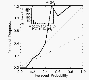
times each probability value was predicted.  The reliability diagram for the 24-hour POPhi
forecasts (right) shows a reliability curve much closer to the diagonal
at low probabilities, but veering sharply away for probabilities of 0.5
or greater. However, these higher probabilities were rarely forecast
(only eight forecasts of POPhi equal to 0.5 or more) so
the reliability curve is noisy because of undersampling. (In practice
it is a good idea
to plot data only when there are enough samples.)
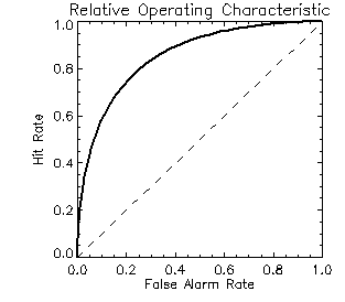
 A forecast that discriminates perfectly would have a ROC curve that
starts in the lower left and follows the y-axis (false alarm rate=0)
up to the top left corner, then follows the top axis (hit rate=1) to
the upper right corner. The area under the ROC curve is a scalar
measure that is frequently used to summarize the resolution. The
perfect
value is 1.0 and the no-skill value is 0.5. For the Tampere forecasts
the following ROC areas are obtained using both a simple trapezoid
method and a curve-fitting method (preferred) to
estimate the area under the curve:
A forecast that discriminates perfectly would have a ROC curve that
starts in the lower left and follows the y-axis (false alarm rate=0)
up to the top left corner, then follows the top axis (hit rate=1) to
the upper right corner. The area under the ROC curve is a scalar
measure that is frequently used to summarize the resolution. The
perfect
value is 1.0 and the no-skill value is 0.5. For the Tampere forecasts
the following ROC areas are obtained using both a simple trapezoid
method and a curve-fitting method (preferred) to
estimate the area under the curve:| 24-hour forecasts |
48-hour forecasts |
|||
| POP |
POPhi |
POP |
POPhi |
|
| ROC area (trapezoid rule) |
0.857 |
0.849 |
0.767 |
0.763 |
| ROC area (curve fitting) |
0.855 |
0.870 |
0.771 |
0.785 |
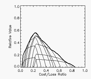
 and this envelope may look quite lumpy. The relative value curve shown
here for
the 24-hour POP forecasts is a case in point. The lighter
curves represent the relative value as a function of cost/loss ratio
using each of the probabilities as a yes/no threshold for the forecast,
while the heavy curve is the outer envelope representing the maximum
relative value possible. The maximum relative value of 0.57 occurred
for a moderate cost/loss ratio of 0.23, which is the climatological
frequency of rain in the sample. This plot shows that the POP forecasts
have value for all decision makers except those with very low cost/loss
ratios (who would always protect) or very high cost/loss ratios (who
would never protect).
 | 24-hour forecasts |
48-hour forecasts | |
| RPS |
0.091 |
0.111 |
| RPSS |
0.222 |
0.069 |